What to Consider Before Choosing the Colors for Label

Choosing the Colors for Label

Image Source : Cut Sheet Labels

he right selection and use of the colors will add to the aesthetic and relevancy of your product. Imagine a retail product without a label. 

It would be a guess-game to determine what that container contains. 

Product labels tell customers about the product. This is why creating the right product label is a lot of responsibility. It makes all the difference to the success of an inventory, given how shoppers make their decisions about which products to buy in-store. 

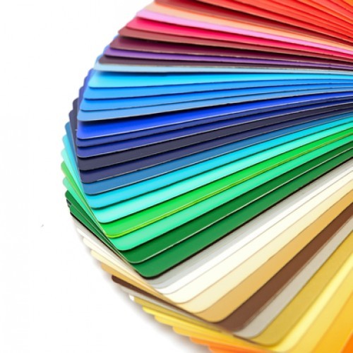
Color is one of the important factors to keep in mind while creating your product label. Colors can convey a message by influencing consumer’s emotions through a beautiful label. What do you think when you see the fire engine red of Coca Cola? Or how do you react when you notice the red-yellow logo of Burger King? While the vibrant red of Coke makes you feel happy and excited, the red-yellow of Burger King may stimulate your appetite. This is what experts called the emotional impact of the colors. 

Therefore, you should be careful while choosing the color of your product label. And this brief guide will help you in this context. 

Choose Positive Colors:

Colors trigger different psychological responses. Therefore, choose the color that is relevant to your brand. Here are some appealing colors along with their emotional impact. 

  • Green represents the environment and nature. It promotes relaxation and tranquility. The color is said to minimize blood pressure. You can consider green for your herbal or eco-friendly products. 
  • White symbolizes cleanliness, purity, and relaxation. It makes people feel secure. 
  • Black stands for wisdom, stability, and luxury. 
  • Blue is the color of serenity and happiness. It represents trust and reliability. 
  • Orange stands for hunger, adventure, and vitality. Self-confidence is also associated with this color. 

Create Contrast with Legible Color Combination:

You need to choose another color to create contrast with your primary color. For example, you have chosen a green that should be combined with the contrastive color.

The key to successful pairing text and the background color is the contrast between lightness and darkness and vice versa. The more contrast you have, the more legible your text look. It also reduces eye-strain and makes your design look more pleasing. 

You can use the color wheel to determining the best pair of colors. For example, you can choose a dark color from the bottom half of the when with a light one from the top. 

Some successful pairings of the colors are…

  • Black on Yellow
  • Blue on White (vice versa)
  • Green on White (vice versa)
  • Red on White (vice versa)

Or it is better if you use an online tool to determine the right color combination. 

Get Creative with Labels:

You can try various shades and materials for your labels.

For example, metallic labels are shiny and eye-catching. The silver and gold metallic labels minimize represent quality, making them the right option for your luxury product. Silver label symbolizes glamour and sophistication. Gold is the ultimate symbol of sophistication.

Fluorescent colors or neon are great for getting attention. If you want to create a happy and positive personality of your brand, these are your go-to colors. 

What about those clear or transparent labels? They are a great way to facilitate openness and transparency while letting the appearance of your products do the talking. 

So these are some points while choosing the colors for your label. However, it’s up to you to decide the look and feel of your brand. It is not required to be guided by traditional norms. Whatever you choose, make sure your product’s label looks appealing, visible, readable and relevant to the customers. 

Top 4 Innovative Packaging Ideas

Innovative packaging ideas
IMG Source: Orange Creative

Here’s how you can get creative with your packaging to make your products look stand out.

Over the years, more and more businesses have invested in creative packaging. As the name suggests, creative packaging is any packaging design that helps the product look attractive and get noticed. Creative packaging also involves cost-effective and eco-friendly options.

Apart from looking attractive, these packaging forms are functional.

For example, some French fries wrappers come with a small pouch in the front for ketchup. The packaging part of some pizza boxes separates with the slice to help you avoid greasy and burnt fingers. A lid of some butter boxes can be used as a spoon.

Innovation in packaging will make your product stand out from the rest. It will help build your brand as well as provide some personality to your products. After all, the products are initially judged by your packaging.

So, how do you create creative packaging?

For your help, here we have rounded up some creative packaging ideas that will bring some innovations for your products.

Add Something to Your Packaging:

This is a great solution to make your standard packaging stand out from the crowd. The best example is a line of pasta sauces by Amy’s Kitchen. The sauce comes in a standard size jar with standard color labels. What makes them look unique is the paper and gold bow over the lid of the jar. It looks as if your grandmother has packed it.

Think about Handmade Look:

Customers are attracted to packaging that feels personalized. And the handmade packaging is close to this notion. This is because they look different than their machine-made counterparts. They offer much higher quality as well as details. Another reason that makes them favorite among customers is that they are eco-friendly and consume less energy. Handmade packaging goes well with botanical or natural products.

Add a Fun Element:

Adding fun to your packaging won’t seem odd. After all, they are attractive to all age groups other than kids. The bright colors and unusual shapes also work in products for adults, although it requires a more subtle approach.

Take a cue from the wine industry and look at how their labels feature animals in a fun way. You can get quirky, creative, funny and artistic with your packaging. Make sure that the color or style you choose can resonate with your brand.

Consider Your Target Audience:

Getting creative with your packaging doesn’t mean to forget about your target buyers. Make sure your packaging remains functional and attractive to your demographic. For example, a range of Axe’s grooming product aims at young men aged between 18 and 35. So their packaging is built to this specific audience. For example, Axe Shower Gel’s comes in a rugged black plastic container. It looks as if the container contains motor oil. What to say about Tiffany’s robin’s egg blue box?

Bottom Line:

So these are some innovative packaging ideas that can attract the customers towards your products, thereby boosting the sale. Keep in mind that your packaging not only contains your product but also delivers a final marketing message to the buyers. Again, make sure your packaging goes well with your products as well as your target audience.

Take one or two of these ideas and think you can incorporate them with your products.

What do you think? Please let us know by commenting below.

How Colors Impact Your Food Packaging

How Colors Impact Your Food Packaging
Img Source colorpsychology

Learn here how colors make your products look like to the customers.

Some colors make us feel relaxed and clam. Some colors unleash positivity. And certain colors have been associated with increased metabolism, eyestrain and blood pressure.

The point is here that color impacts our mood and feelings.

No wonder why they are a vital part of marketing for decades. Using them strategically can make your products look appealing to the customers. Given that packaging is the most tangible representation of a product, introducing them in the right colors can make or break the sale.

According to one report, 60-90% of consumers judge the products on the base of the color. This is because color appeals quicker than text and graphics. Over 80% of customers admitted that color is a key factor when buying a product.

Color schemes eventually become a brand identity and are consistently maintained. For example, red with a white swirl makes us think about Coca Cola. The color purple is associated with the Cadbury brand.

Why You Should Be Careful with Careful Scheme of Your Packaging

Colors stand for emotions and feelings.

Therefore, be careful while choosing a color scheme for your target audience. For example, bright colors are appealing to children while softer shades are great for older consumers. Colors like green or blue represent eco-friendly and health.

Here we have outlined some colors and their impact on the mind.

 Red:

Red is a powerful color that stimulates and excites. It can raise the nerve impulses as well as increase the heart rate. This color enhances the appetite and stimulates a physical response. No wonder why it is a popular choice in food marketing and found on the many food product packaging. Red is associated with the images of ripe or sweet things like candy, tomatoes, and strawberries.  

Yellow:

Yellow is quickly processed by the brain, making it a good one for grabbing attention. It is also an appetite stimulant and stands for happiness, optimism, and vibrancy. When you look at the color yellow, the brain releases a feel-good chemical known as Serotonin according to some studies. Using red and yellow together not only makes people feel good about your products but also triggers their appetite. Look at the logos of Burger King, McDonald’s, Pizza Hut and KFC and you will understand this thing better.

 Orange:

Orange is a combination of red and yellow. It generates similar effects and has established itself as an appetizing color. It promotes senses and emotions which can trigger impulse buying, making it a great choice for takeaway foods and snacks. Orange also represents citrus flavor like in Fanta.  

Blue:

Blue is not an appetizing color. However, it stands for honesty and truth. The color is associated with water and freshness; therefore, it can be used for products like bottled water, seafood, and milk.  

Green:

Green is also a popular packaging color. It is mainly associated with healthy, natural, organic, vegetarian and fresh. The color is also the symbol of well-being and health. The color is a choice of many organic and herbal products.  

White:

White stands for purity and simplicity. People think that the product doesn’t contain many ingredients when used in packaging. It is generally used for white color products such as yogurt, cream, milk, and cheese.  

Black:

Black is the least used color in food packaging. However, food experts are experimenting with this color to see some positive outcomes. Black is the color of luxury and can be used to give your products an air of sophistication. Brands who are seeing benefits with black are Jack Daniels and Monster Energy.

So you must have understood how colors can impact your food packaging. What do you think? Please let us know by commenting below. 


5 DIY IDEAS TO GLAM UP YOUR TOTE BAG

tote bag  
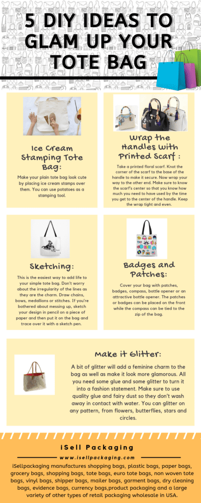
img source : thesprucecrafts   

Here are some easy DIY ideas to glam up your plain tote bag.

A simple canvas tote bag not only stores your stuff but also acts as a stylish accessory to carry with. You can use it anywhere, whether it’s a workplace or a beach. With plenty of fabrics and colors, they are some of the versatile bags to carry around for all your requirements.

And guess what— you can get creative to turn them into an amazing accessory. There are many ways to give a fabulous makeover to your plain tote bag. Here we have rounded up a few of them.

Ice Cream Stamping Tote Bag:

Make your plain tote bag look cute by placing ice cream stamps over them. You can use potatoes as a stamping tool. Here’s how…

  • Carve circles for the ice cream and a triangle for the cone from your potatoes using brown paint color. Apply the “potato stamp” to the bag to transfer the impression.
  • Take another potato and carve a shape of ice cream to be placed on the top of the cone using pink paint. Now, place it over the top of the cone that is on the bag. This way, you can create more ice-creams.
  • Let it dry.
  • Your amazing ice cream stamping tote bag is ready.

5 DIY IDEAS TO GLAM UP YOUR TOTE BAG

Wrap the Handles with Printed Scarf:

This is a simple yet exciting way to glam up your plain tote bag. Take a printed floral scarf. Knot the corner of the scarf to the base of the handle to make it secure. Now wrap your way to the other end. Make sure to know the scarf’s center so that you know how much you need to have used by the time you get to the center of the handle. Keep the wrap tight and even. You should have just enough left over to tie a second knot at the other end. When you reach to that point, you can tuck the loose ends away or leave them out.

Sketching:

This is the easiest way to add life to your simple tote bag. Don’t worry about the irregularity of the lines as they are the charm. Draw chains, bows, medallions or stitches. If you’re bothered about messing up, sketch your design in pencil on a piece of paper and then put it on the bag and trace over it with a sketch pen. The ink will seep through the paper, providing you a foggy version of your initial sketching. To avoid smudging, let the ink dry fully, then trace over the design again with your paint pen.

Badges and Patches:

Cover your bag with patches, badges, compass, bottle opener or an attractive bottle opener. The patches or badges can be placed on the front while the compass can be tied to the zip of the bag.

Make it Glitter:

A bit of glitter will add a feminine charm to the bag as well as make it look more glamorous. All you need some glue and some glitter to turn it into a fashion statement. Make sure to use quality glue and fairy dust so they don’t wash away in contact with water. You can glitter on any pattern, from flowers, butterflies, stars and circles.

So these are some great ideas to spruce up your plain tote bag. What do you think? Please let us know by commenting below.

Eco-Friendly Packaging Ideas to Get Inspiration

Eco Friendly Packaging
Img Source: small business bonfire

Eco-friendly packaging ideas not only reduce carbon footprints but also maintain the faith of customers into your products. Here are a few of them.

Billions of tons of waste are going to landfills and oceans every year. This will turn our land and water into dumping ground over the years.

That’s why today’s consumers are increasingly environmentally conscious.

They are also more aware of product packaging than before. The customers are more likely to feel connected with that brand with the sustainability of the practice which secures its position in their minds. The customers are likely to buy again and remain loyal to the company.

This has prompted companies to use materials and methods that have a minimum impact on the environment.

Therefore, it is worth if your organization integrate its packaging strategy with eco-friendly and sustainable practices. However, some might not agree as it is expensive and hassling. But there are some key advantages—besides reducing carbon footprints—to go green.

And here are some exciting ways of packaging your products in an eco-friendly way.

Paper Bottles:

Ecologic, a Californian company, really deserves a pat on the back for this wonderful idea. They have produced paper bottles from recyclable materials. The outer shells are manufactured from recycled newspaper and cardboard. The recycled newspaper hides a thin, plastic recycled liner inside.

Eco-Friendly Light Bulb Packaging:

It is quite frustrating to go through too much unnecessary packaging inside the box. Well, an eco-friendly light bulb packaging for GE bulb is a fresh change. It is made of a single strip of recyclable cardboard and protects the bulb while displaying.

Reusable Bag:

Puma has introduced a reusable bag that is made from raw materials. According to the company’s claim, the manufacturing process consumed less than 40% of water, energy, and fuel compared to traditional bag manufacturing process.

Carton Wine:

 Wine boxes are generally not appealing. However, it can’t be denied that they are an eco-friendly option. YB Wines has introduced its wine in carton believing that each box reduces the carbon footprint of the average bottle of wine in half.

Leaf Plates:

Leaf Republic has made its packaging products from leaves. The lid is made from recycled plastic or bioplastic, while a three-layer natural bowl is made of leaves, waterproof leaf paper, and leaves. No synthetic additives, glue or coloring have been used. The bowl is simply biodegradable.

Plantable Packaging:

Pangea Organics is known for creating 100% plant-based beauty products. However, the company has taken a giant leap in this context. The packaging can now grow trees.

They have “planted” organic seeds like basil and amaranth into the boxes so that when the customer soak the box in water after taking out the product and plant it in the earth, the plant will grow.


So you must have seen how innovation is rapidly changing the packaging industry. This is also the need of time as customers are more inclining towards the company doing sustainability. What do you think? Please let us know by commenting below.