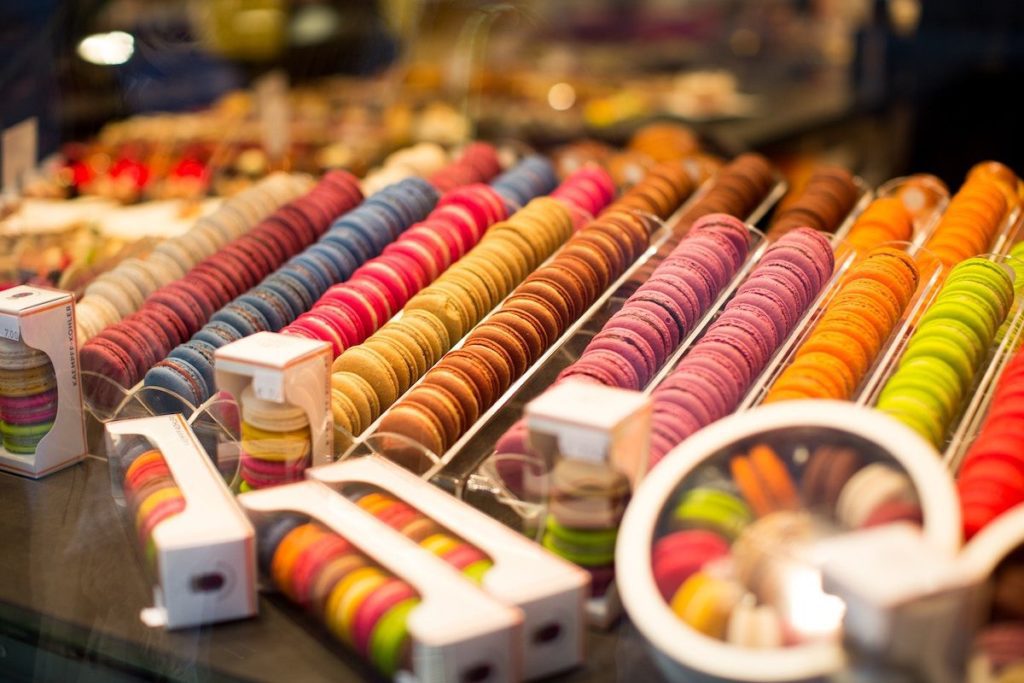
Learn here how colors make your products look like to the customers.
Some colors make us feel relaxed and clam. Some colors unleash positivity. And certain colors have been associated with increased metabolism, eyestrain and blood pressure.
The point is here that color impacts our mood and feelings.
No wonder why they are a vital part of marketing for decades. Using them strategically can make your products look appealing to the customers. Given that packaging is the most tangible representation of a product, introducing them in the right colors can make or break the sale.
According to one report, 60-90% of consumers judge the products on the base of the color. This is because color appeals quicker than text and graphics. Over 80% of customers admitted that color is a key factor when buying a product.
Color schemes eventually become a brand identity and are consistently maintained. For example, red with a white swirl makes us think about Coca Cola. The color purple is associated with the Cadbury brand.
Why You Should Be Careful with Careful Scheme of Your Packaging
Colors stand for emotions and feelings.
Therefore, be careful while choosing a color scheme for your target audience. For example, bright colors are appealing to children while softer shades are great for older consumers. Colors like green or blue represent eco-friendly and health.
Here we have outlined some colors and their impact on the mind.
Red:
Red is a powerful color that stimulates and excites. It can raise the nerve impulses as well as increase the heart rate. This color enhances the appetite and stimulates a physical response. No wonder why it is a popular choice in food marketing and found on the many food product packaging. Red is associated with the images of ripe or sweet things like candy, tomatoes, and strawberries.
Yellow:
Yellow is quickly processed by the brain, making it a good one for grabbing attention. It is also an appetite stimulant and stands for happiness, optimism, and vibrancy. When you look at the color yellow, the brain releases a feel-good chemical known as Serotonin according to some studies. Using red and yellow together not only makes people feel good about your products but also triggers their appetite. Look at the logos of Burger King, McDonald’s, Pizza Hut and KFC and you will understand this thing better.
Orange:
Orange is a combination of red and yellow. It generates similar effects and has established itself as an appetizing color. It promotes senses and emotions which can trigger impulse buying, making it a great choice for takeaway foods and snacks. Orange also represents citrus flavor like in Fanta.
Blue:
Blue is not an appetizing color. However, it stands for honesty and truth. The color is associated with water and freshness; therefore, it can be used for products like bottled water, seafood, and milk.
Green:
Green is also a popular packaging color. It is mainly associated with healthy, natural, organic, vegetarian and fresh. The color is also the symbol of well-being and health. The color is a choice of many organic and herbal products.
White:
White stands for purity and simplicity. People think that the product doesn’t contain many ingredients when used in packaging. It is generally used for white color products such as yogurt, cream, milk, and cheese.
Black:
Black is the least used color in food packaging. However, food experts are experimenting with this color to see some positive outcomes. Black is the color of luxury and can be used to give your products an air of sophistication. Brands who are seeing benefits with black are Jack Daniels and Monster Energy.
So you must have understood how colors can impact your food packaging. What do you think? Please let us know by commenting below.


